Olivia’s general idea of what she would like to be expressed through this logo was not only her bubbly personality, but her role as a healer and helper. There was some creative thinking put together to find the right image that would represent who she was, and how she viewed holistic nutrition as a whole.
After a lot of trial and error, with inspiration coming from so many different directions, Olivia and I combined aspects of previous logo iterations that we dreamt up and paired them with the image that she believed would truly represent what holistic nutrition, and holistic care, is meant to look and feel like.
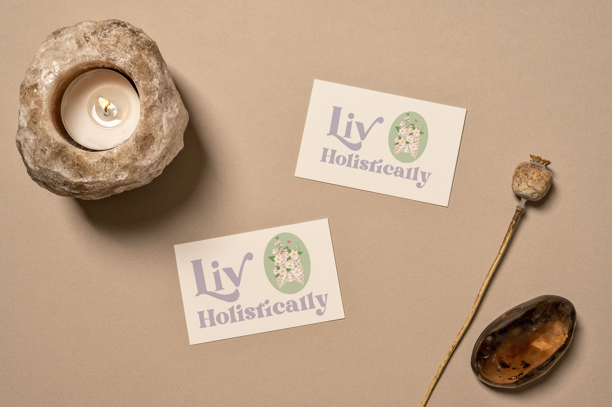
Holistic Nutrition Final Logo Design
Liv Holistically Logo Breakdown
The vibe of this project was to stick with a ‘groovy’ and vibrant feel to the logo.
The font choice was Battlefin Black, with some minor edits to make the ‘L’ and ‘V’ in Liv be more pronounced. The color scheme was meant to be vibrant but with softer tones, to compliment the natural sense of holistic care and nutrition.
The ribs with the flowers are to represent healing and growing from the inside out, and how holistic nutrition and care is one of the many ways people can achieve the feeling that this logo represents.
Do you have an idea you want to see brought to life? Let's Chat!